Tuesday, 12 September 2017

Stephen King's IT - Trailer Analysis


This trailer is for the film IT.

I would say this trailer is mainly aimed for boys and girl teenagers because most horrors are a 15 and the target audience would be attracted to the younger audience because of the age rating. But also teenagers are mostly going to watch horrors because they want to be frightened as so they wouldn't want to see it again.

There is many reasons why teenagers would watch this type of film and it starts off with Mise en Scene. At the start of the scene we can see a teenage boy making a paper boat for his little brother, with the audience seeing this they are getting a first look of the first two characters of the trailer. The boys are wearing old fashion clothing because the film is set around the 1980's as back then the fashion wasn't like what it is now in 2017. 25 seconds in the trailer and we can see that the younger boy, George is wearing a bright yellow rain coat. This is effective because it is making the audience focus on what George is wearing and that he stands out in the rain which intentionally makes us think what could happen in the next few seconds because this scene is now focused on George because of the yellow rain coat. George then runs into a post, making him fall over and loosing his paper boat as it is flowing down the road because of the wind and rain also this is when George sees the antagonist of the film which is effective because the audience are getting a first glimpse of IT. It then moves on to a group of teenage boys on their bikes and we are also seeing what type of clothes they are wearing which is old fashion casual clothing because of what the fashion was like in the 1980's but also because teenager boys stereotypical wear causal clothing and don't normally care what they look like unless the want to look "cool" or "trendy". Its 52 seconds into the trailer and the audience now know what most of the characters looks like which is good because this makes the audience engage more as they know what they seeing when they see the film in cinemas. 49 seconds into the trailer and we are seeing the first glimpse of the location of wear the film is being filmed but also were the characters are living. Now it looks very family friendly were the characters are living, because there is a school which shows that children must live in this area, can also see a few houses that families must live in and parks for children to go play in. This is effective because the audience now know what type of area they live in. I also forgot to mention at 42 seconds we see a brief second of the antagonist known as IT and what we can just see of him is his white pale face which is really effective because this then gets the audience engaged into the film because they want to see more of IT and that is what the first 52 seconds of the trailer has done, it has got the audience engage more because of the way they have made the trailer.

There is then sound in the trailer which makes it more effective because without the sound, the trailer would be very boring. At the start of the trailer the sound is very tense, a piano is being played in the background which is non-diegetic sound, this is being played when Billy is making the paper boat for George.This is effective because with the piano playing at this certain scene this is making the audience think that something exciting and scary is going to happen. The sound then starts to pick up when George is outside in the rain and it is thundering and lightening which is diegetic sound because George can hear what is outside. With both of these sounds, it makes the first 24 seconds tense and engaging for the audience because they want to know what is going to happen when George is running down the road with this paper boat. At 25 seconds both non-diegetic and diegetic sound come to a stop because George has ran into a post causing him to fall over on the road. The non-diegetic sound then comes back when George is sitting up and the paper boat is flowing away from him, the sound is dark and tense making the audience think something bad may happen because of the way the sound is being used in the trailer. George is then running to catch up with the paper boat and we then see the paper boat go down a drain and hearing George shout "Nooo", his voice then fades in with the non-diegetic sound, making the trailer appeal to the audience when they are watching the trailer. Once the paper boat is down the drain, the tense music comes to a stop because George is looking down the drain. As the non-diegetic sound has stopped, we are now hearing more of the rain,  telling the audience that it is raining outside but also making the trailer more effective. As George is looking down the drain trying to look for his paper boat, the camera is zooming into the drain and at this point there is no sound happening which is making it very tense as the audience feel like something may jump out, this also gets the audience more engaged into the film. Throughout the whole trailer the music is very tense because there is so much happening in different scenes, for example when the red balloon appears in the library the music is quiet but tense and it then moves onto a different scene, hearing a child speaking "We all float down here" this is suggesting it could be Georgie speaking because he was the last child being kidnapped. The tempo of the music then starts to rise when the group of friends are going down into the sewers and the tempo goes up and down throughout the trailer making the audience have feel excited but also their adrenaline  is hyping up because of the sound being used which is non-digetic because the audience can not hear this type of music being played. At the end of the trailer Bill is down in the basement and can see his little brother Georgie and Georgie is speaking to Bill, saying "Bill if you come down, you'll float to" he then keeps repeating it and ends up shouting it and this is when IT appears from the water and runs towards Bill, with the tempo of the music being tense because it will make the audience feel off edge.

In the trailer, many camera shots and angles are being used, so that it will make the trailer effective and more exciting for the audience when they watch it, but also so that if one camera shot was used for the whole trailer, people would lose interest and wouldn't end up seeing the film in cinema. The first three seconds of the trailer there is a close up of Bill folding a piece of paper to make it into a boat for Georgie, this camera shot is effective because we are seeing what Bill is making but also the boat is a prop which is important for the first part of the film. 12 seconds into the trailer and there is a two person shot being used, this is effective because this is now the first time the audience are seeing the two main characters of the film, Georgie and Bill who both are brothers in this film. In this shot we can also see what the characters look like by what they are wearing and we can tell who is Bill and who is Georgie. There is then a high angle of Georgie in the rain running after the paper boat which is floating along the water on the road. This is effective because the audience are seeing a little bit of the location of where Georige is running which seems to be down a road he lives in. A medium shot is being used when there is a boy in the library, this shot is effective because the audience are seeing a different location but also the red balloon is floating along the room which is effective because the balloon is a big part of the film. This shot will make the audience engage more because there is a random balloon in the room and this will make the audience feel curious. Another close up is being used in the trailer when the group of friends are looking through photos and map to figure where IT lives, while this is happening the protector flicks through the photos and while this is happening the camera is using a close up because the women in the picture is starting to change into IT, which is effective because this is very tense and spooky for the audience to watch.

Editing in the trailer is being used because that's how it is made into a trailer because if it wasn't edited, it would make the audience feel confused and it wouldn't look like a trailer. At the start of the trailer editing is being used which is the cutting tool, first we can see Billy folding the boat together and then it cuts to Warner Bros Pictures which is effective for the audience because they are now knowing who distributed the film. After this being shown it is then cut back to Billy finishing off making the boat for Georgie. A black screen is part of editing and this is being used when Georgie meets IT for the first time, the black screen then gets put into place and then text comes up saying "From Stephen King's Terrifying Novel" which is effective because many people in the audience might not know about this and this is also advertising Stephen King's novel for the audience. Fast pace editing is used in the trailer when it goes through the different scenes, this is effective because it is giving a tease to the audience of what scenes are included, but also by using the fast pace, the audience are going to engage more because they want to see more of the film.

Monday, 11 September 2017

IT - Film Poster

Image result for it movie poster

The poster above is for this film which is a horror called IT. On the poster there is a clown down a drain looking up with a slight smile and wearing clown makeup, the slight smile has a creepiness to it because of course this film is a horror and has to have something creepy to it. This clown subverts a stereotype of a clown because clowns are normally nice and make jokes, this one doesn't, this clown is known for kidnapping children and then killing them which is why it subverts the stereotype of clowns. There is a red balloon which indicate blood because it being a horror, blood is normally involved and in the original IT the balloon was full of blood so maybe in the new remake it will be the same which would be effective because the audience would be happy because they didn't change anything from the original.  

Another feature on this poster which is effective is the colour being used on the poster, the poster is full of dark colours which is effective because it is making the poster look creepy, spooky and horror like which is what the audience wants because it will then make them engage more for them to go to the cinema to see this film.

On the poster there isn't much text only because it looks like it is trying to focus on the clown more. This poster does look like it is teasing the audience because it doesn't have a date of when the film is going to be released into cinemas, so I think it is effective because teasing the audience always get the adrenaline hyped up which is always good for these type of films and as this film is a horror people adrenaline will be very high. The title of the film "IT" in a bold and clear font which is in the colour blood red it also has the name of the author who wrote the novel of "IT" which is effective because the audience will know now who he is by researching more about him. The slogan at the top even tells the audience it is a novel as it says "Based on the terrifying novel" which is marketing the authors book so people in the audience who don't have the novel can go online or in store to buy it. 


Titanic - Film Poster

Image result for film posters


The poster above is for this film which is a romantic-disaster called Titanic.  On the poster it shows the two main characters who are called Jack and Rose and these are the characters who fall in love on the Titanic. By having the two characters large in the background it makes it clear to the audience who they are and how they are the main characters. What we can see with these two characters is that they are close to each other, holding hands, Jack is looking down to her and Rose is looking down at his chest. This suggest these two are in some way romantically involved with each other because of the body language of both of them. On the poster you can see what the characters are wearing, Rose is in a blue dress and is wearing jewelry indicating she is rich and has a wealthy life, whereas Jack is in white t-shirt and braces indicating he is poor and doesn't have much money.  

There is then something else which makes the poster appeal to the audience, is the boat of course which is under Rose and Jack, because it is less important because the audience need to know the main characters and also have a better look at them, but also it is a little important because the boat is a big thing in the film because without the boat know as the Titanic, Rose and Jack wouldn't of been able to get romantically involved because that is how they both met. The title of the film is effective because it is named after the boat "Titanic". There is then blue dark waves splashing against the boat which is effective because the waves look quite rough suggesting the boat is strong and dominate in the sea. 

The text is also another feature which makes the poster stand out. The film title "Titanic" is in bold, clear text but also looks elegant which is effective because it shows that Rose looks elegant because of the way she looks, it is also in a colour of white which relates to the boat and Jack's white t-shirt. At the top of the poster it is also in the same font saying "From the director of "Alien", "T2" and "True Lies" "which is effective because it is telling the audience what else the director has direct, not only Titanic. There is then a slogan below the title of the film saying "Nothing On Earth Could Come Between Them" this is then suggesting nothing on this earth can get in their way and it shows how much they are in love just by seeing how they look at each other shows nothing can get in their way. The lighting of the poster is really good because it light and draw in, showing that Rose and Jack are in love and looking happy rather than if it was to be dull and dark the audience would know straight away they wouldn't be happy neither in love. 


 The poster has included the name of the actor and actress who are playing Rose and Jack, those people are Leonardo DiCaprio who plays Jack who has been in other films such as Romeo and Juliet and Kate Winslet who plays Rose who has also been in different films such as A Little Chaos. Having the name of the actor and actress is a unique selling point as the audience will be more engaged into the poster and film because it has well know actors/actress' in.

Jaws - Film Poster


Image result for movie posters

The poster above is for this film which is a Mystery/Drama called JAWS. On the poster we can see that there is a huge shark swimming towards air but also the women who is swimming along in the sea because the shark is wondering what else could be moving in the water. This is effective because the shark is shown as being the antagonist because sharks are a dangerous mammal  but also in the poster the shark looks like it is ready to attack its prey because it has its mouth open with long sharp teeth and looking up at the women swimming across. 

The women who is swimming across is a big part of this poster because she is the vulnerable one but doesn't know she is going to be attacked. The reason why there is a women swimming instead of a man is because stereotypical women are vulnerable, weak and scared and can be dramatic. This is why she is the one swimming across in the sea. The poster looks like a painting rather than it being made on a computer using CGI, which is very effective because it is something different rather than it being the same like the other posters being made for other films. 

The text also makes the poster stand out more, for example the film title "JAWS" it is bold and clear but also in the colour red, which can also symbol blood because when a shark attacks something, blood is always coming from that something. This is effective because it links to the shark swimming up to the women swimming. The name of the actors and actress' are also in black bold writing which is effective as well because the audience are then able to read it. 

At the top of the poster it shows us the name of the actors and actress' starring in this film, this is good because then the audience will then know who is in the film but can also research more about the actors and actress' if they don't know who they are. At the bottom of the poster there is the film credits which include co-starring, what production it is, the screenplay, what it is based on which is a novel it was based on, who the music was by which was John Williams who is a composer and he has composed different film music such as theme music in Star Wars, Jurrasic Park and the first three Harry Potter films. 

Harry Potter and the Order Of The Phoenix - Film Poster

Image result for film posters

The poster above is for this film which is a Fantasy/Mystery called Harry Potter and The Order Of The Phoenix. In the poster we can see a few characters around the side and then in the middle the main character which of course is Harry Potter, this is effective because Harry is in the middle suggesting he has more power than the rest of the characters because they are standing around him rather than next to him. Harry is wearing causal clothing because he is a teenager in this film, he is wearing black jeans, red top and a jacket while holding a wand to represent that he is a wizard and to tell the audience that this film is fantasy. The rest of the characters seem to be wearing school uniform except for Hermione Granger, where she is wearing causal clothing same as Harry, this is effective because it is giving the audience something to think about as she isn't in the uniform like the other characters, she is also holding a wand in her hand to. With the background of the poster being dull and dark it suggests to the audience that this film is a mystery and has darkness in it, why a I saying this? Because it relates to the slogan at the top of the poster saying "The Rebellion Begins" which goes back to why the poster could be dull and dark instead of it being full of bright colours. 

This poster is quite unique, I am saying this because the characters are all looking straight to the camera and this is very effective because it looks like they are looking at the audience which makes the audience feels a little off edge because this film is a mystery. 

Now on this poster we can't see the actors names which would normally be at the top of the poster but the characters on the poster look very familiar, such as Daniel Radcliff who plays Harry Potter is known to be in other films such as The Women In Black, there is then Emma Watson who plays Hermione Granger is known to be in other films such as a recent new Disney film called Beauty and the Beast and Rupert Grint who plays Ron Weasley is known to be in other films such as a new film which was released this year called Snatch. These three actors/actress' are the three main characters in the whole series of Harry Potter. 

The text of the film title is in a funky font lets just say that, its clear and bold to read but it is unique because it is something different the audience can see. Harry Potter is in bigger writing suggesting he is the main focus in the film but also the main main character throughout the whole series of the films. The name of the film is called "The Order of The Phoenix" which is part of the film series of Harry Potter and that part of the text is smaller and just about clear to be able to read. 

At the bottom of the poster there is the film credits and in the film credits it says who produces the film, who created the poster and the actors and actress' staring in the film. There is then the release date for the film coming out to cinemas which is the July 13th 2007 this is then showing the audience the date of the film so that they know when to see it in cinemas. One more thing which is effective is that there is a website www.harrypotterorderofthephoenix.com this is showing the audience if they want to find out anything more about the film they can go on this website and this is good marketing for the film because fans will be able to check the website out.

Beauty and The Beast - Film Poster


Image result for movie posters

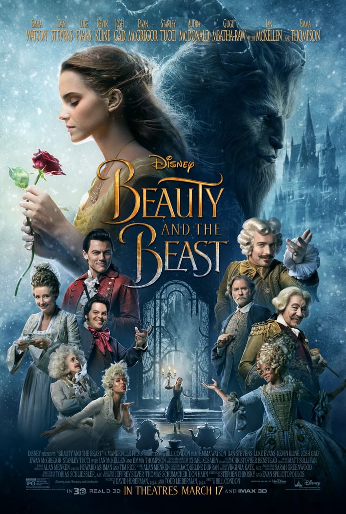
The poster above is for this film is a Fantasy/Romance called Beauty and The Beast. In this poster we can see that at the top are the two main characters, Belle and Beast. This is effective because the main characters are standing out more which is great because the audience will then be able to tell who is the main characters and who isn't. Belle has her eyes closed while holding a red rose in her hand, there is a bright sparkly light on her face showing that she has brightness in her life and is friendly, but on the right is the other main character Beast. We can tell that he doesn't seem happy because of the facial expressions on his face looking very plain and dull, but also on his side he has a castle which is far in the background on this poster, suggesting he might own that castle, it is also dark and dull on his side of the poster showing he may have a dark side but also because of the emotions the Beast is showing. 

Around the poster we can see the rest of the characters from this film which is really effective for the audience because they are getting the first look of what the other characters look like and it is also teasing the audience because the posters always come before the trailer. The way the characters have been laid out on the poster is really good because it has the two main characters at the top to show they are important and they look like they have more power than the characters below and then below they have the rest of the characters so that they can give the audience that tease. In the middle of the poster is a window and a lady holding candles, that lady is also Belle and it is a first glimpse of inside the castle which Beast owns. This is effective because its is showing something different on the poster rather than showing the characters like most film posters do. 

At the top of the poster you can see the celebrities of who is staring in the film, there is popular actors and actress' such as Emma Watson, who has been know for being Hermione Granger in the Harry Potter film series, Dan Stevens who was in the TV series Downtown Abbey, Emma Thompson who is also in this film is known as Nanny McPhee in the film Nanny McPhee and being a midwife in the new Bridget Jones film Bridge Jones' Baby and many more well know actors and actress's are in this film to. But with having the celebrities names at the top of the poster is good because the audience then know straight away who is going to be staring in the new Disney film. 

In the middle of the poster has the title of the film because it would make sense having it on the poster, so it can let the audience know which film is being advertised on this poster, but also having Disney above the film title is effective because it is showing us Disney is distributing this film and letting the audience know it is a Disney film. At the bottom of the poster is the movie credits just to give credit to the people who made the poster, made/produce the film, having the actors and actress' name in the credits to just so that when it gets released, people who were involved in this film we be grateful for the credit giving. This poster tells us when the film is going to be released into cinemas which is "In Theaters March 17", telling the audience when the film is to be released and so they should note down the date for it. This is also in a golden colour, looking bold and clear to read.  


The Hobbit Film Magazine - Film Magazine


Image result for film magazine

Above is the Empire magazine for the film The Hobbit. This magazine is a really good one that stands out a lot, we can see the protagonist and the antagonist on the front cover which is good and effective for the audience because they are getting a first look of the two characters from this film. 

At the top of the magazine the text says "Precious Exclusive When Gollum Met Bilbo!" this is really effective because the word "Precious" is a quote used by Gollum from the film before The Hobbit, Lord Of The Rings. The text also says "When Gollum Met Bilbo!" this is effective because both of the characters haven't met each other before and this shall be exciting for the audience as they will be able to watch the film and react to these characters meeting for the first time. At the bottom of the magazine it has the title of the film "The Hobbit" which is in a golden colour and looking very bold which is relating to the character Bilbo with the sword as he is looking bold while holding the object. This text is also making it clear enough for the readers to be able to read which is great as it stands out well. There is then a slogan, "The finest middle-earth coverage continues inside..." which is very effective for the readers and the audience because they will then engage more into the magazine and find out more about the film and characters.

Now onto the characters, we can see Bilbo holding a sword and Gollum in the back ground watching him. Bilbo is wearing a red coat and a white shirt underneath and having a sword in his hand, this is making him look fierce and strong, but his facial expressions tell us something different, he looks kind of scared or breathless as he may be fighting for something or someone, but he doesn't seem to be holding the sword with much grip. Now Gollum is the background of the front cover and seems to be glaring at Bilbo like he is his enemy. Gollum is a creature which was formed from Lord Of The Rings and of course has his "Precious" which is the ring that might be the reason why he is glaring at Bilbo because he doesn't want anyone to take his "Precious". The background the of two characters is very dark and dull suggesting there is a dark side to this film because of the body language also of the characters on the front cover. 


Pirates Of The Caribbean - Film Magazine


Image result for film magazine

Above is a film magazine of Pirates Of The Caribbean, which has been published by Empire. On the front cover there is the main character of course which is Captain Jack Sparrow who is supposedly the protagonist of the film. As the main figure on the front cover of this magazine, we can see what the character looks like for the first time, the type of clothing he is wearing is a white shirt ripped slightly with a blue waist coat around it and then a belt to hold weapons. In his hand he is holding a gun, this is suggesting he could be the antagonist instead of the protagonist because of him holding a weapon but also the facial expression he has, he looks very serious and could have a dark side to him. 

The text "Empire" is in a bright red, looking bold and clear so that the audience can tell which magazine it is because the text is behind Captain Jack Sparrow. Below the characters hand it says "Starring, Captain Jack's all new crew" this is a good bit of the text on the magazine because when the audience see this they are intrigued of who Jack's new crew will be and will be able to find out when reading the magazine. Most of the text is in a bright yellow which can be hard for readers to read because of where it is on the magazine, but it makes Captain Jack stand out a lot with this kind of text, which is good because the magazine is focusing on this character. 

Empire is a big film magazine company and so they like to be competitive to other film magazines. Also on the front cover of this magazine, Empire are also advertising other films so that they magazine isn't only just about Pirates Of The Caribbean. 

Sunday, 10 September 2017

The Amazing Spider - Man - Film Magazine


Image result for film magazine

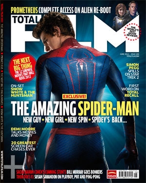
Above is the film magazine for "The Amazing Spider Man" and again this magazine is one that stands out a lot and is effective for the audience. 

First thing I can see which stands out for me is the main character in the center of the magazine which has the spider man costume on. This is effective because the audience are seeing who the main character are and getting an idea of what the film could be about only because of what we can see on the back of the main character which is a logo of a spider and as the film is called "The Amazing Spider Man" we can tell this is already the main character. The background of the magazine is a dark blue, but around where spider man is there is a light blue flashing onto him, suggesting he is the main person of the film but also that he is the protagonist of this film because the light is shining on him and only him. 

The body language of the Spider Man makes me think that he also may have a dark side to him only because of the direction he is looking in and how his hands are, the magazine is mainly focusing on this character because of the outfit which stands out so well, red and blue go together and the magazine manage to make it fit well for the front cover so that the audience would be appealed. 

The text of magazine is bold and clear so that the audience are able to see what has been written. Something that really stands out is the title of the film, what is standing out is the "Spider Man" of the film title, which is good because it is making it clear for the audience what this magazine is about so they have coloured that part of the title so its more engaging and noticeable. Above the film title it says "exclusive" which gets the audience engaged more because its a magazine exclusive for fans or others of the film "The Amazing Spider Man". Also below the film title there is a slogan saying "new guy, new girl, new spin, Spidey's back" this slogan is great because its get the audience hyped for the film coming out but giving them a tease of what is in store of the new spider man film. 

This magazine also has different topics to talk about, such as "On set Snow White and The Huntsman" which might be appealed to different types of the audience which can be effective because this magazine can have different target audience.

Beauty and The Beast - Film Magazine


Related image

Above you can see that the company "Total Film" is advertising "Beauty and The Beast" which is the film for this magazine. There is many great things about this magazine which makes it appealing for the audience and it is also very eye catchy for them. On the front cover of this magazine what we can see is the two main characters of the film, Belle and Beast, how can we see this? We can already tell that Belle is the beauty because the text of "Beauty" is over her making it clear the audience she is the beauty of the film, whereas "Beast" under "Beauty" is showing that the beast is at the back of Belle looking at the other direction, we know he is the beast because of the way he looks but also the horns coming out of his head. 

At the top of the magazine is the title of the magazine which is called "Total Film", this text is behind the beast so that the audience can see more of the character and also so that the beast can stand out more. At the end of the text we can see Spider Man which is effective for the audience because this magazine isn't only advertising "Beauty and The Beast" it is also advertising a little bit of the new film "Spider Man Homecoming" The text which is covering Belle, seems to be quite elegant and bold because this film is a Disney film but also because of what the story line is about because there is love and darkness in this love story of "Beauty and The Beast". Under the title there is a small slogan "Darker, Smarter... Relevant" this is suggesting that the film has a darker side to it because of the Beast and some love stories mainly have a dark side to it to make it more enjoyable for the audience who are watching that type of film. 

Now about the characters, we can see Belle is a bright yellow dress holding a red rose, showing that she is bright and friendly and is the protagonist of the film, but whereas the Beast in the background he is looking dull and dark, suggesting he may not have emotions and that he has a dark side to him and that he is the antagonist of the film. Also with these two characters you can just see behind them the castle which is where the Beast lives, this may not be clear for some of the audience as they may not be able to see it because it isn't show much like the characters, but you can just about see it near the title of the magazine. 

The layout of the magazine is really good because it has the two main characters in the center of front cover making the audience understand who the main characters are as they are standing out more because of what they are wearing and the different colours to them to. Also the text is bold and clear so that the audience can read it well enough.

The Dark Knight - Film Magazine


Image result for horror film magazine


Above is the The Dark Knight film magazine and there is many thing to this magazine which make it stand out to the audience. First of all we can the antagonist which is the Joker in the film, how can we tell? By the way the characters face is on the magazine as he isn't smiling and that he has a small but creepy smile which makes him look scary for the audience when they see the front cover of this magazine. The Joker also subverts the way he looks, for example he is meant to look like a clown, but he doesn't have the red nose or the fluffy hair he just looks like a psychopath more which is more effective because its always good to have something different in action adventure films. 

The text of the magazine is bold and clear for the audience to read. It is good for this magazine to have bold writing because it makes the magazine effective as it goes along with the main character on the front cover. "Empire" is the main thing that is standing out most of this magazine because it is bold and black with green going around the text making it clear for the audience to be able to read. This text standing out of this magazine is ok because it is advertising the company of the magazine but the title of the film should be a bit bigger only because then the audience can then tell straight away which film they are advertising on the magazine.

Around The Jokers face is a dark background to make his face stand out more as his face is the main thing about this magazine, but not all the way round is a black background, you can just see the outfit he is wearing which seems to be a purple suit and a green tie which this can relate to a joker on a pack of cards or a different type of clown. Being able to see his outfit is effective for the audience because it is the first time the audience are seeing the antagonist. 

This magazine is really relating to the antagonist of the film which is good because then the audience can see the bad person of the film instead of the good person which would be Batman, because sometimes in these types of films we know more about the protagonist than the antagonist. 


Use of Titles

The Use Of Titles:                               Throughout our trailer, there are several different types of titles being used. For exam...